Editorial + Minimal · AI image style prompt
Op Stripe Card Editorial
Playing-card editorial language with optical black ink ribbons, monumental high-contrast serif type, and a crisp colored figure on textured light paper.
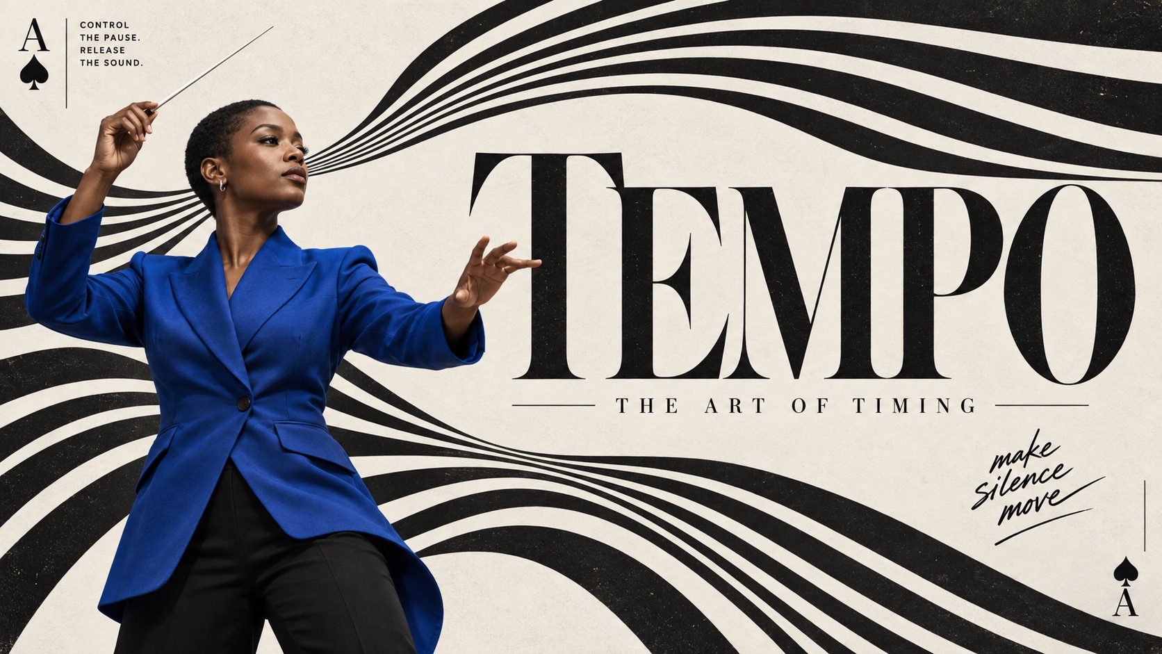
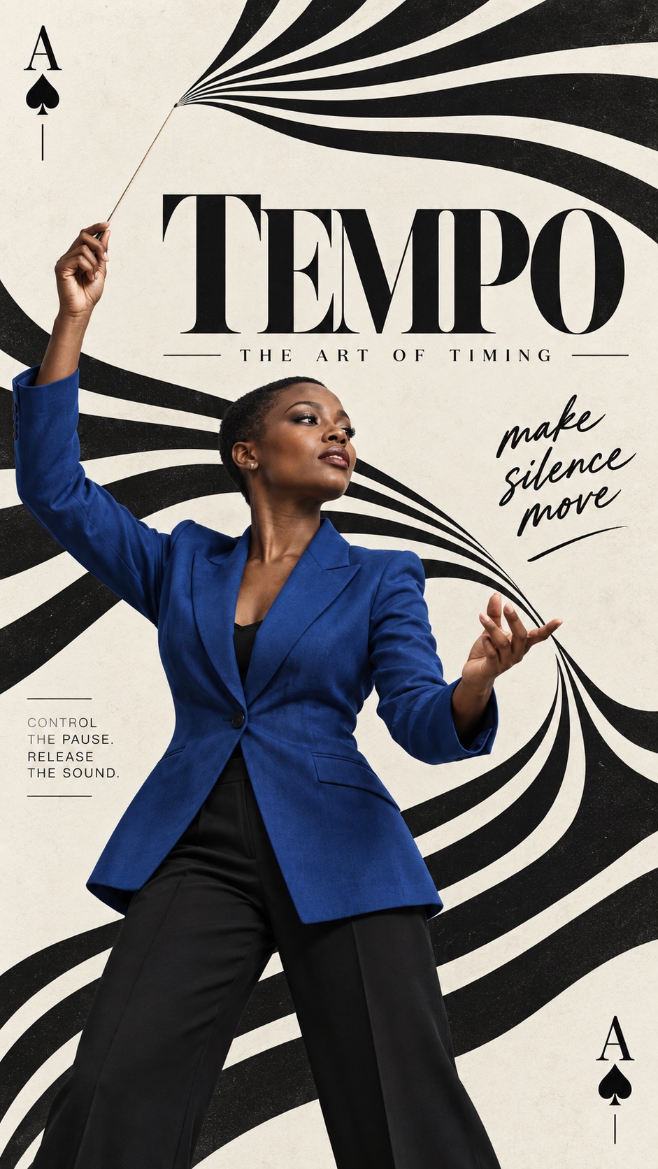
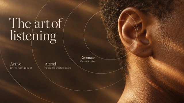
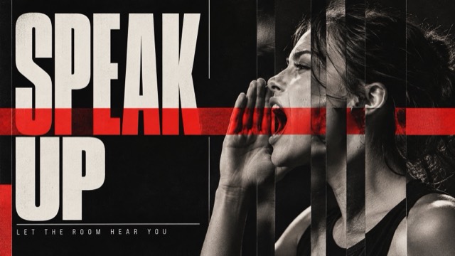
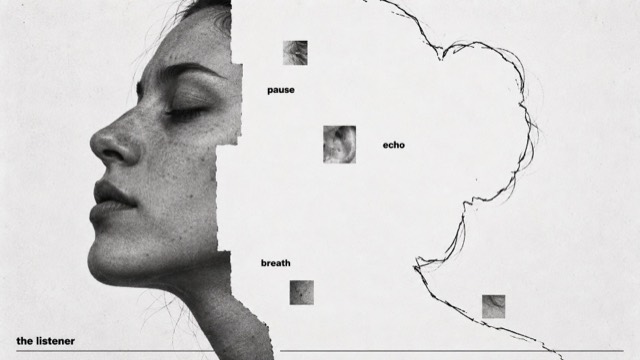
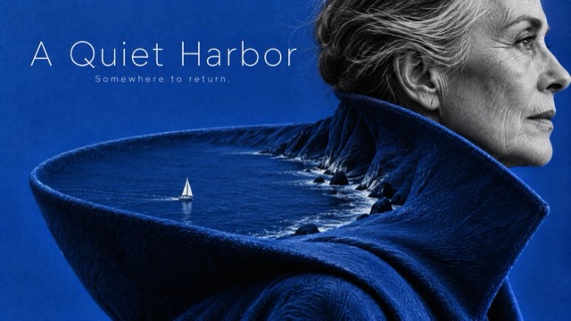
4 example cases
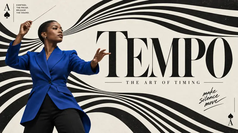
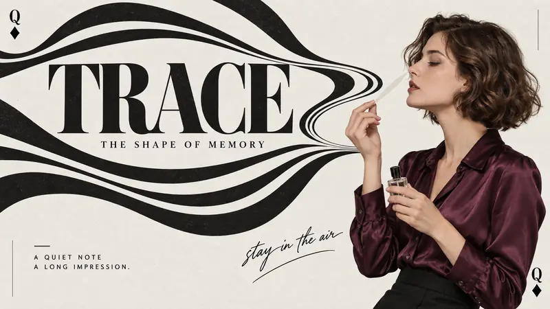
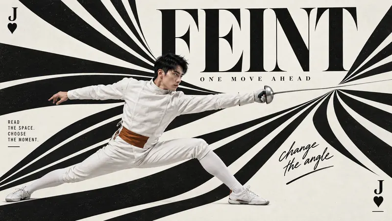
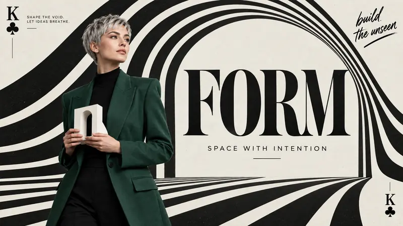
Same style.json, different subjects. Each case's values are in the examples section of the JSON.
What this style does
Playing-card editorial language meets optical black ink ribbons, monumental high-contrast serif type and a crisp colored photographic person on subtly textured light paper.
Signature traits
- Flowing black ink stripes alternate with light paper, bending, fanning or converging into a strong optical field that participates in the composition; flat graphic ribbons rather than glossy 3D tubes.
- Monumental high-contrast display serif lettering and a crisp full-color photographic cutout share the main hierarchy against the nearly monochrome graphic field.
- Playing-card-like rank/suit indexing and small editorial marginalia frame the design, mixing compact sans copy with expressive brush handwriting; typography remains readable.
- Stripe geometry may express gesture, air, force or structure. Its direction, negative space and relationship to the figure can change by case; a central spiral is not mandatory.
- Pose, crop, figure placement and headline shape are open design decisions guided by the theme. Choose a different spatial relationship per case without replicating the source seated silhouette.
- Use a restrained wardrobe or prop color against black and light neutral paper, chosen for each theme; do not lock orange trousers, grey knitwear or a particular suit.
style.json
{
  "style_version": "1.0",
  "style_name": "Op Stripe Card Editorial",
  "style_slug": "op-stripe-card-editorial",
  "style_summary": "Playing-card editorial language meets optical black ink ribbons, monumental high-contrast serif type and a crisp colored photographic person on subtly textured light paper.",
  "environment_variables": {
    "ASPECT_RATIO": "9:16 or 16:9",
    "STYLE_FIDELITY_ANCHORS": "Essential style identity and design freedoms",
    "SOURCE_CONTENT_TO_AVOID": "Source identities and exact content excluded",
    "SUBJECT": "Fictional adult person, styling and action",
    "MAIN_TEXT": "Complete large serif headline",
    "SECONDARY_TEXT": "Small editorial deck line",
    "ANNOTATION": "Expressive short handwritten note",
    "MICRO_COPY": "Small editorial copy",
    "CARD_INDEX": "Corner rank and suit glyph",
    "DESIGN_DIRECTION": "Theme-led optical geometry and interaction",
    "PORTRAIT_DIRECTION": "Vertical composition intention",
    "LANDSCAPE_DIRECTION": "Horizontal composition intention",
    "SUBJECT_ACTION": "a poised posture presented like a figure printed on a playing card",
    "PRODUCT_OR_PROP": "the card index mark and the optical black ink ribbons framing the figure",
    "LOCATION": "a subtly textured light paper field with no real setting",
    "BACKGROUND_ELEMENTS": "optical black stripe ribbons, card corner indices and micro copy",
    "ACCENT_SYMBOL": "the card index symbol in the corner",
    "WARDROBE_STYLE": "crisp contemporary clothing in one saturated color against the black ribbons"
  },
  "style_fidelity_anchors": [
    "[CORE] Flowing black ink stripes alternate with light paper, bending, fanning or converging into a strong optical field that participates in the composition; flat graphic ribbons rather than glossy 3D tubes.",
    "[CORE] Monumental high-contrast display serif lettering and a crisp full-color photographic cutout share the main hierarchy against the nearly monochrome graphic field.",
    "[CORE] Playing-card-like rank/suit indexing and small editorial marginalia frame the design, mixing compact sans copy with expressive brush handwriting; typography remains readable.",
    "[FLEX] Stripe geometry may express gesture, air, force or structure. Its direction, negative space and relationship to the figure can change by case; a central spiral is not mandatory.",
    "[FLEX] Pose, crop, figure placement and headline shape are open design decisions guided by the theme. Choose a different spatial relationship per case without replicating the source seated silhouette.",
    "[FLEX] Use a restrained wardrobe or prop color against black and light neutral paper, chosen for each theme; do not lock orange trousers, grey knitwear or a particular suit.",
    "[FLEX] Corner indexing, small boxes, rules, underlines and accent marks can be arranged sparsely around useful space; retain editorial rhythm without copying all source ornaments."
  ],
  "source_content_to_avoid": [
    "Exact reference woman, finger-wave hairstyle, glasses and cheek-resting seated pose",
    "TWO OF A KIND and the original quotes or brush slogans",
    "The paired two-of-clubs identity and exact corner sizes",
    "Original barcode, crown doodle and exact central vortex layout"
  ],
  "visual_deconstruction": {
    "observations": "Source uses light slightly warm neutral paper, black tapered spirals, warped Didone letters, colored seated figure, opposing corner card marks and small editorial copy. These exact placements are source observations.",
    "transfer": "Preserve the graphic/photo contrast, optical movement, serif/sans/brush hierarchy and card-like editorial frame; reinterpret geometry through each theme."
  },
  "composition": {
    "portrait": "Use the case vertical direction to create strong top-to-bottom movement with integrated title and figure. Leave quiet margins for brief readable editorial copy.",
    "landscape": "Rebuild the optical movement across the width using the case horizontal direction, with an independently placed full title and figure; not a centered miniature portrait poster."
  },
  "typography": {
    "display": "Oversized high-contrast Didone-like serif with narrow elegant counters and strong vertical stress. May stretch or bend subtly with optical geometry while remaining readable.",
    "small": "Compact black editorial sans in a few carefully placed blocks; short hand-brushed annotation adds energy."
  },
  "color_palette": {
    "base": "Dense matte black and pale neutral stone/off-white paper, subtle natural paper warmth rather than aged yellow.",
    "accent": "Single coherent wardrobe/prop color family per case, natural skin and photographic highlights."
  },
  "image_treatment": {
    "photograph": "Sharp studio editorial cutout, realistic skin, garment folds and hands, soft plausible contact shadow only where needed; no rectangular photo panel.",
    "texture": "Subtle fine even paper grain and sparse tiny ink imperfections in broad black print fields, as on the reference. Do not exaggerate into coarse fibers, scratches, stained edges or global grunge; preserve crisp photograph and readable type."
  },
  "design_rules": [
    "Keep main title and short editorial copy complete and readable.",
    "Make the stripes respond to the case rather than repeating one swirl behind every person.",
    "Keep the person visually distinct from black graphic ribbons; allow intentional overlap without hiding the key action.",
    "Treat card indices as editorial devices; use sparse marginalia with comfortable reading space."
  ],
  "do": [
    "Design interaction among subject gesture, stripe movement and typography.",
    "Balance rich black graphic fields with quiet paper and a controlled photographic color accent.",
    "Compose both ratios independently with continuity of the case idea."
  ],
  "avoid": [
    "A central seated model plus identical spiral for every case.",
    "Flat generic sans headline, glossy 3D ribbons or a literal photographed playing card mockup.",
    "Heavy antique paper aging, dense unreadable microtext and arbitrary ornament overload."
  ],
  "negative_prompt": "No source face, source pose, source slogans, watermark, barcode, crown, two-of-clubs pair, glossy 3D ribbons, fake distressed edges, unreadable headline, extra fingers, merged limbs or unrelated props.",
  "prompt_template": "Create a finished full-bleed fashion/editorial poster at {ASPECT_RATIO}. Essential visual language: black-and-light optical ink ribbons, monumental high-contrast serif typography, one crisp full-color photographic cutout of a fictional adult, and playing-card-inspired editorial marginalia. Rules and freedoms: {STYLE_FIDELITY_ANCHORS}. Subject: {SUBJECT}. Main title exactly \"{MAIN_TEXT}\", large, complete and clearly readable, elegant high-contrast display SERIF rather than heavy sans. Smaller deck exactly \"{SECONDARY_TEXT}\". One expressive handwritten note exactly \"{ANNOTATION}\". Small readable editorial copy \"{MICRO_COPY}\". Corner index motif: {CARD_INDEX}; use it as a pair of economical editorial markers, not a full literal card border. Design intention: {DESIGN_DIRECTION}. For 9:16: {PORTRAIT_DIRECTION}. For 16:9: {LANDSCAPE_DIRECTION}. Choose the precise layout, title placement and stripe geometry intelligently within this intention; avoid a formulaic source-layout copy. Ribbons are printed black shapes separated by light paper, not physical tubes. Use pale neutral stone/off-white opaque paper with subtle fine even grain and sparse tiny ink imperfections in broad black regions, no coarse fibers or aging stains. Photographic subject stays crisp, with believable hands and clothing; all specified text readable. Exclude {SOURCE_CONTENT_TO_AVOID}. Do not add filler text, watermarks, barcode, crown doodles, grunge scratches, extra props or fake paper mockup shadows.",
  "examples": [
    {
      "case_name": "tempo",
      "values": {
        "SUBJECT": "Fictional adult Black female orchestral conductor with close-cropped hair, cobalt-blue tailored jacket and black trousers, standing in an expressive three-quarter pose with one raised conducting baton and the other hand shaping the phrase; confident studio photograph",
        "MAIN_TEXT": "TEMPO",
        "SECONDARY_TEXT": "THE ART OF TIMING",
        "ANNOTATION": "make silence move",
        "MICRO_COPY": "CONTROL THE PAUSE. RELEASE THE SOUND.",
        "CARD_INDEX": "A with a black spade glyph",
        "DESIGN_DIRECTION": "The baton appears to organize black ribbon lines into a sweeping musical phrase. The lines bend around the raised hand and release into a broad fan; typography participates in the rhythmic pauses. A gesture-driven composition, not a generic vortex behind a person.",
        "PORTRAIT_DIRECTION": "The standing figure anchors the lower side; a tall rising ribbon fan responds to the raised baton and opens a quiet interval for the full title.",
        "LANDSCAPE_DIRECTION": "Conductor at one side conducts a wide sideways ribbon fan across the frame; headline occupies a purposeful pause between converging bands, with generous space for editorial notes."
      }
    },
    {
      "case_name": "trace",
      "values": {
        "SUBJECT": "Fictional adult female perfumer with a short wavy brown bob, plum silk blouse and tailored black skirt, shown waist-up in profile thoughtfully lifting one slim paper scent blotter near the nose; a small clear unbranded perfume bottle in the other hand",
        "MAIN_TEXT": "TRACE",
        "SECONDARY_TEXT": "THE SHAPE OF MEMORY",
        "ANNOTATION": "stay in the air",
        "MICRO_COPY": "A QUIET NOTE. A LONG IMPRESSION.",
        "CARD_INDEX": "Q with a black diamond glyph",
        "DESIGN_DIRECTION": "Optical ribbon contours suggest an invisible fragrance trail. Open, offset loops rise from the blotter and weave through title negative spaces; retain breathing room, avoid smoke rendering or a symmetrical target.",
        "PORTRAIT_DIRECTION": "Profile cutout low and off-center, airy open loops rise through the page around the title, with ample pale paper between bands.",
        "LANDSCAPE_DIRECTION": "Profile figure at right looks into an open horizontal trail of offset loops across the left; title lives inside a quiet pocket of the trail rather than over the face."
      }
    },
    {
      "case_name": "feint",
      "values": {
        "SUBJECT": "Fictional adult East Asian male fencer with cropped black hair, unmasked, in a modern white fencing jacket with a restrained burnt-amber waist accent and white trousers, captured in a dynamic extended fencing lunge holding a single slender foil; studio sports-fashion photograph",
        "MAIN_TEXT": "FEINT",
        "SECONDARY_TEXT": "ONE MOVE AHEAD",
        "ANNOTATION": "change the angle",
        "MICRO_COPY": "READ THE SPACE. CHOOSE THE MOMENT.",
        "CARD_INDEX": "J with a black heart glyph",
        "DESIGN_DIRECTION": "A foil line splits the optical field into two deflected fans, visualizing a feint. Black bands respond to the blade direction and body momentum, with sharp open wedges instead of a circular spiral. Preserve visible fencing action.",
        "PORTRAIT_DIRECTION": "Diagonal lunge crosses the lower half; split fans climb above the foil and form a tapered opening for the title without hiding the blade.",
        "LANDSCAPE_DIRECTION": "Full horizontal lunge spans a broad wedge of pale space; two black stripe fans diverge around the blade's path, with large headline counterbalancing the rear leg."
      }
    },
    {
      "case_name": "form",
      "values": {
        "SUBJECT": "Fictional adult female architect with a silver pixie cut, jade-green structured jacket over black clothes, standing in thoughtful three-quarter view and holding one small white abstract arch model at chest level; crisp studio editorial photograph",
        "MAIN_TEXT": "FORM",
        "SECONDARY_TEXT": "SPACE WITH INTENTION",
        "ANNOTATION": "build the unseen",
        "MICRO_COPY": "SHAPE THE VOID. LET IDEAS BREATHE.",
        "CARD_INDEX": "K with a black club glyph",
        "DESIGN_DIRECTION": "Optical ribbons expand the small handheld architectural arch into an immense printed arch of negative space. The figure stands at its threshold and typography anchors the opening, making the paper void itself the architectural subject.",
        "PORTRAIT_DIRECTION": "A tall asymmetric striped arch occupies most height, with figure off-axis at its threshold and a readable headline bridging the upper opening.",
        "LANDSCAPE_DIRECTION": "A low wide striped arch frames an open paper courtyard, figure and small model on one side and the large title occupying the void; keep it graphic rather than a 3D building."
      }
    }
  ],
  "category": "Editorial + Minimal"
}