Product + Campaign · AI image style prompt
Jade Glyph Grocer Collage Poster Style
Cream grocer posters with jade glyphs, vegetable silhouettes, and glossy produce-photo centerpieces.
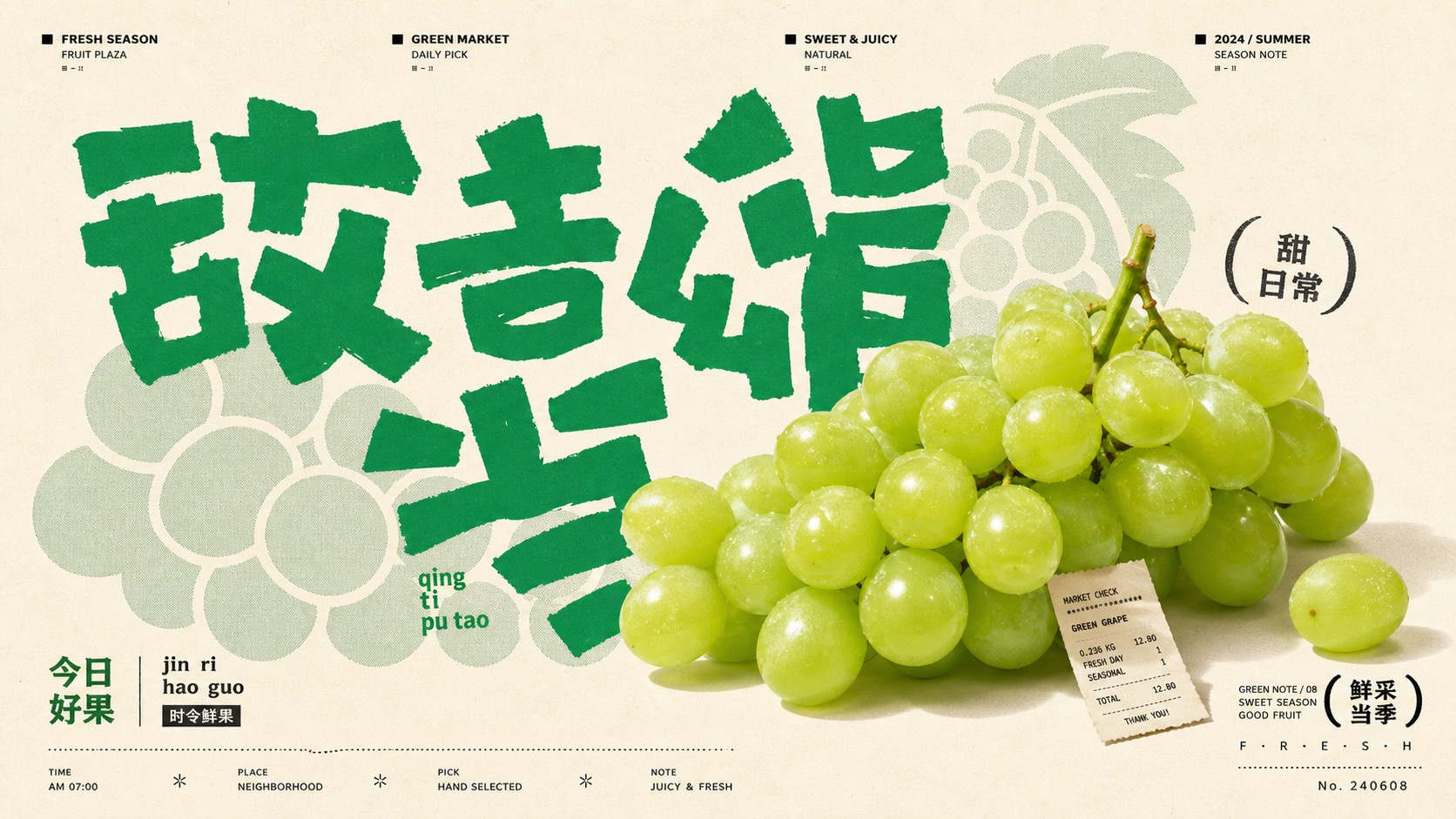
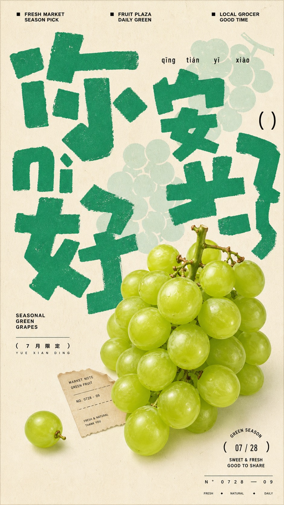
4 example cases
Same style.json, different subjects. Each case's values are in the examples section of the JSON.
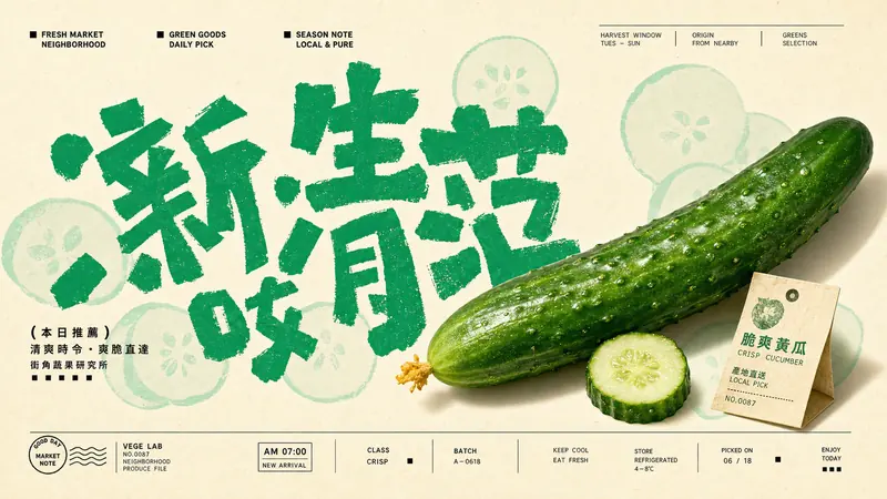
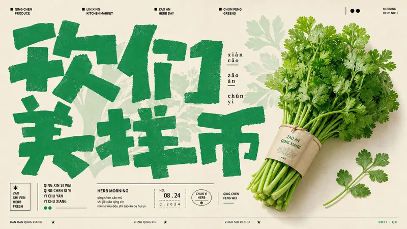
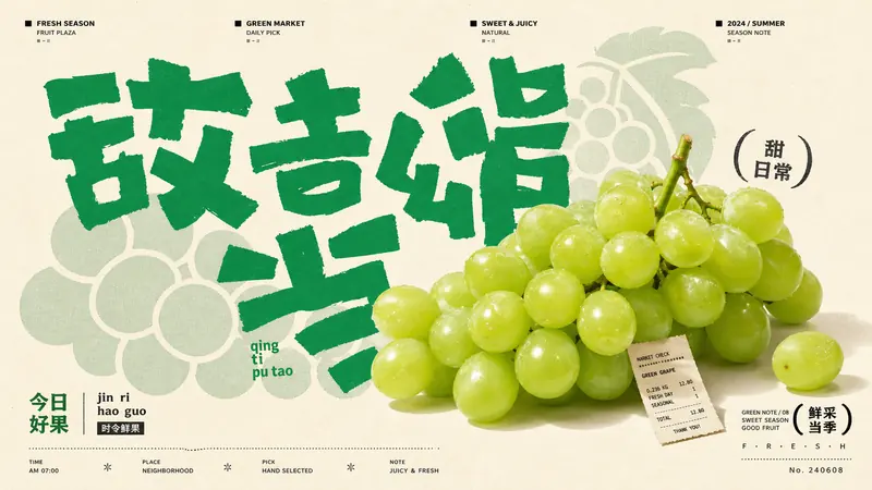
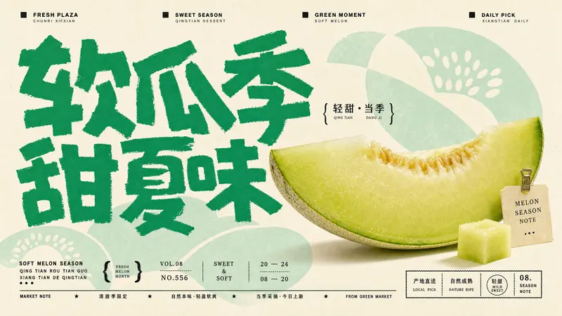
What this style does
A sparse East Asian grocer-poster system built from warm cream paper, oversized jade-green hand-cut glyphs, pale vegetable silhouette clouds, tiny editorial headers, and one glossy produce-photo centerpiece layered over the typography.
Signature traits
- Warm cream or ivory poster paper dominates the canvas, with no scenic background and only soft paper grain.
- One saturated jade or produce-green ink family controls the headline, accent glyphs, and most graphic marks.
- Oversized hand-cut glyphs are rough, blocky, irregular, and arranged like abstract CJK poster lettering rather than clean typography.
- A realistic glossy product photo is layered in front of the glyphs, cropped large enough to become the main dimensional object.
- Pale mint botanical silhouette clouds sit behind the type and product as soft flat shape fields, not detailed illustrations.
- Tiny black editorial labels sit along the top edge with small square bullets and spaced uppercase micro text.
style.json
{
  "style_name": "Jade Glyph Grocer Collage Poster Style",
  "style_slug": "jade-glyph-grocer-collage-poster-style",
  "style_version": "1.0.0",
  "style_summary": "A sparse East Asian grocer-poster system built from warm cream paper, oversized jade-green hand-cut glyphs, pale vegetable silhouette clouds, tiny editorial headers, and one glossy produce-photo centerpiece layered over the typography.",
  "category": "Product + Campaign",
  "environment_variables": {
    "SUBJECT": "main fresh-market product, produce item, or food object",
    "SUBJECT_ACTION": "still-life pose or poster gesture",
    "PRODUCT_OR_PROP": "secondary product, leaf, tag, utensil, or market prop",
    "LOCATION": "minimal grocer, produce plaza, kitchen-market, or seasonal poster setting",
    "BACKGROUND_ELEMENTS": "pale botanical silhouettes, tiny labels, micro marks, stamps, and editorial header details",
    "MAIN_TEXT": "oversized rough glyph headline or hand-cut typographic mass",
    "SECONDARY_TEXT": "tiny editorial header and small bottom caption treatment",
    "ACCENT_SYMBOL": "small separator mark, dot, square, parenthesis, or seal detail",
    "WARDROBE_STYLE": "styling direction for optional human presence, packaging, or prop handling",
    "STYLE_FIDELITY_ANCHORS": "observable style traits that must remain visible",
    "SOURCE_CONTENT_TO_AVOID": "literal source content that generated samples must not recreate",
    "ASPECT_RATIO": "9:16 or 16:9"
  },
  "style_fidelity_anchors": [
    "Warm cream or ivory poster paper dominates the canvas, with no scenic background and only soft paper grain.",
    "One saturated jade or produce-green ink family controls the headline, accent glyphs, and most graphic marks.",
    "Oversized hand-cut glyphs are rough, blocky, irregular, and arranged like abstract CJK poster lettering rather than clean typography.",
    "A realistic glossy product photo is layered in front of the glyphs, cropped large enough to become the main dimensional object.",
    "Pale mint botanical silhouette clouds sit behind the type and product as soft flat shape fields, not detailed illustrations.",
    "Tiny black editorial labels sit along the top edge with small square bullets and spaced uppercase micro text.",
    "Small bottom caption blocks use mixed black micro type, compact stacked characters, date-like numerals, and stamp-like balance.",
    "The layout is asymmetrical and poster-flat: giant glyph field, one product anchor, and small information clusters.",
    "Typography scale jumps sharply from huge playful glyphs to very small header/caption labels.",
    "The product has natural photo lighting, bright highlights, and shallow depth while the rest remains flat print graphics.",
    "Visual density is medium-sparse: several large glyphs and two or three small caption zones, but no cluttered market shelf.",
    "Mood feels fresh, handmade, youthful, and neighborhood-grocer editorial rather than corporate produce advertising."
  ],
  "source_content_to_avoid": [
    "Do not recreate cabbage, bok choy, lettuce head, or a green round leafy vegetable as the hero subject.",
    "Do not copy the original Chinese characters, pinyin fragments, NIHAO CAI wording, SHUCAI wording, or the 2023.08.05 date.",
    "Do not repeat the exact poster story about vegetables loving the viewer or the same stacked vertical slogan.",
    "Do not use the same large cabbage photo placement in the lower center with identical pale cabbage silhouettes.",
    "Do not copy the exact top three label texts or the same black bottom-right signature block.",
    "Do not include watermarks, usernames, QR codes, platform badges, or real grocer brand marks.",
    "Do not make the sample a direct Chinese vegetable poster with the same composition and text hierarchy."
  ],
  "visual_deconstruction": {
    "overall_style_category": "Contemporary East Asian fresh-grocer poster collage combining rough green hand-lettering, soft botanical silhouettes, and one photoreal product cutout.",
    "composition_and_layout": "A narrow cream poster field carries a top micro-navigation row, a large irregular glyph field, pale mint silhouette blobs, a large photo object in the lower or side field, and compact bottom information blocks.",
    "subject_placement": "The product photo should overlap or interrupt the large glyph field, sitting forward like a cutout pasted over flat print graphics.",
    "camera_or_perspective": "Close product still-life perspective, front-facing or three-quarter, with natural highlights and minimal shadow.",
    "typography_style": "Huge rough jade-green glyphs with naive brush/cut-paper edges; tiny black editorial labels at top and bottom for contrast.",
    "color_palette": "Warm cream paper, saturated jade green, pale mint backing shapes, black micro type, and small natural color shifts from the product.",
    "graphic_elements": "Soft leafy silhouettes, tiny square bullets, short top labels, compact bottom stamps, pinyin-like micro marks, and occasional dot or bracket accents.",
    "texture_and_finish": "Uncoated paper grain, imperfect ink edges, light print softness, and a clean pasted-photo product cutout.",
    "lighting": "High-key product lighting with glossy highlights; no dramatic cinematic shadows.",
    "mood_and_reference": "Fresh neighborhood produce culture, playful handmade signage, modern editorial poster design, light and friendly."
  },
  "composition": {
    "primary_rule": "Build each image from five layers: cream paper, pale mint botanical silhouettes, oversized jade glyph field, one realistic product cutout, and tiny black editorial captions.",
    "scale": "The main product should occupy roughly 35 to 55 percent of the short side, large enough to overlap the type but not fill the entire canvas.",
    "negative_space": "Leave cream margins visible around at least two sides; do not create a full-bleed scene.",
    "vertical_ratio": "For 9:16, use a tall poster stack: top micro labels, massive glyphs through the upper/middle area, product anchored lower center or lower right, bottom caption block.",
    "horizontal_ratio": "For 16:9, spread the glyph field across the left or center, anchor the product on one side, and place top micro labels and bottom caption blocks as small edge details."
  },
  "typography": {
    "headline": "Use oversized jade-green rough glyphs inspired by hand-cut CJK poster lettering; edges should be uneven, chunky, playful, and slightly dry.",
    "header": "Use tiny black uppercase editorial labels at the top with small square bullets and wide spacing.",
    "caption": "Use compact black micro type near the lower edge or beside the product, mixing tiny Latin, invented pinyin-like fragments, numerals, and stacked caption blocks.",
    "legibility": "Main glyphs can be semi-abstract; the important trait is scale, hand-cut rhythm, and jade ink presence, not exact readable source text.",
    "placement": "Let the product overlap the glyph field while keeping the tiny labels readable as texture-like editorial details."
  },
  "color_palette": {
    "background": "warm cream, ivory, uncoated paper white",
    "primary_ink": "saturated jade green or bright vegetable green",
    "backing_shapes": "pale mint green with low contrast against the paper",
    "micro_type": "near-black ink for tiny labels and caption blocks",
    "product_color": "natural product color, preferably close to the green or fresh-market family with restrained secondary hue",
    "palette_behavior": "Keep the image mostly cream and green, with black only for micro type and tiny marks."
  },
  "image_treatment": {
    "rendering": "Flat printed poster plus one realistic glossy product cutout; the product is photographic, the glyphs and silhouettes are flat ink shapes.",
    "edges": "Glyph edges are rough and hand-cut; botanical silhouettes are soft and rounded; product edges are clean cutout/photo edges.",
    "depth": "Only the product has shallow photographic volume; all other layers remain graphic and flat.",
    "finish": "High-resolution raster poster with subtle paper grain, soft print imperfection, and no vector-clean synthetic finish."
  },
  "design_rules": [
    "Use one main market product or fresh food object per poster.",
    "Place rough jade-green glyphs as the largest graphic layer.",
    "Add pale mint botanical or product-related silhouettes behind the glyphs.",
    "Layer the realistic product cutout over the glyph field so it feels pasted onto the poster.",
    "Keep top labels tiny, black, and editorial rather than logo-like.",
    "Use bottom captions as compact stamp-like information texture.",
    "Maintain a cream-green-black palette with very limited extra color.",
    "Avoid scenic depth, market shelves, many products, price tags, and recipe-table clutter."
  ],
  "do": [
    "Make the jade glyphs large, irregular, playful, and visibly handmade.",
    "Use pale mint silhouette clouds to echo the product shape without adding detail.",
    "Keep one glossy realistic product as the dimensional focal point.",
    "Preserve tiny editorial labels and compact bottom caption blocks.",
    "Let cream paper and negative space remain visible."
  ],
  "avoid": [
    "Do not use cabbage, bok choy, lettuce heads, copied Chinese text, copied pinyin, or the source date.",
    "Do not create a busy supermarket, farmers-market stall, recipe table, or product catalog grid.",
    "Do not switch to watercolor, vector illustration, comic art, 3D toy rendering, or cinematic food photography.",
    "Do not add real logos, QR codes, usernames, watermarks, social UI, or platform badges.",
    "Do not use multicolor rainbow palettes, neon gradients, beige-only palettes, or clean corporate typography."
  ],
  "prompt_template": "Create a {ASPECT_RATIO} image in the Jade Glyph Grocer Collage Poster Style. Subject: {SUBJECT}. Action: {SUBJECT_ACTION}. Prop/Product: {PRODUCT_OR_PROP}. Location: {LOCATION}. Background elements: {BACKGROUND_ELEMENTS}. Main text treatment: {MAIN_TEXT}. Secondary text treatment: {SECONDARY_TEXT}. Accent symbol: {ACCENT_SYMBOL}. Wardrobe/styling: {WARDROBE_STYLE}. Style fidelity anchors that must remain visible: {STYLE_FIDELITY_ANCHORS}. Source content to avoid: {SOURCE_CONTENT_TO_AVOID}. Apply these style rules: warm cream uncoated poster paper; saturated jade-green rough hand-cut glyph headline as the largest graphic layer; pale mint botanical silhouette clouds behind the glyphs; one glossy realistic product-photo cutout layered in front; tiny black editorial labels with small square bullets along the top; compact black bottom caption blocks with invented micro text, date-like numerals, dots, and stamp balance; mostly cream and green palette with restrained black micro type; flat poster construction with shallow product depth only; subtle paper grain, imperfect ink edges, and soft print finish. Important content rule: preserve the visual style first, then change the source content with a new product, new invented text, new silhouette shapes, and a new story premise.",
  "negative_prompt": "cabbage, bok choy, lettuce head, round leafy green vegetable, copied Chinese characters, copied pinyin, NIHAO CAI, SHUCAI, 2023.08.05, exact source slogan, exact source layout, watermark, username, QR code, platform logo, real brand logo, busy supermarket shelf, produce pile, recipe table, price tag clutter, clean corporate typography, neon gradient, watercolor, vector illustration, comic panel, 3D toy render, cinematic kitchen photo, photoreal human face, beige-only palette, rainbow palette",
  "examples": [
    {
      "case_name": "crisp-cucumber-plaza",
      "values": {
        "SUBJECT": "a long glossy cucumber with tiny dew highlights and a clipped blossom end",
        "SUBJECT_ACTION": "resting diagonally as a fresh-market hero cutout over the glyph field",
        "PRODUCT_OR_PROP": "one small cucumber slice echo and a folded cream produce tag",
        "LOCATION": "minimal neighborhood grocer poster on warm cream paper",
        "BACKGROUND_ELEMENTS": "pale mint cucumber-slice silhouettes, tiny top editorial labels, small square bullets, bottom stamp-like micro captions",
        "MAIN_TEXT": "oversized jade-green rough hand-cut glyphs suggesting crisp freshness without copying real source text",
        "SECONDARY_TEXT": "tiny black invented market labels and date-like numerals arranged as editorial texture",
        "ACCENT_SYMBOL": "small black square bullet",
        "WARDROBE_STYLE": "no person; product styled like a clean editorial grocer cutout",
        "STYLE_FIDELITY_ANCHORS": "cream paper, jade rough glyphs, pale mint silhouette clouds, glossy product cutout, tiny top labels, compact bottom captions",
        "SOURCE_CONTENT_TO_AVOID": "no cabbage, no bok choy, no lettuce head, no copied Chinese text, no NIHAO CAI, no source date or slogan"
      }
    },
    {
      "case_name": "fresh-herb-bundle-note",
      "values": {
        "SUBJECT": "a glossy tied bundle of cilantro and parsley stems with bright leafy tips",
        "SUBJECT_ACTION": "tilting upward like a fresh herb bouquet pasted onto the poster",
        "PRODUCT_OR_PROP": "a tiny paper band around the stems and one loose herb sprig",
        "LOCATION": "quiet kitchen-market poster field with no realistic room depth",
        "BACKGROUND_ELEMENTS": "pale mint herb-leaf silhouettes, tiny pinyin-like marks, top navigation labels, small bottom caption stack",
        "MAIN_TEXT": "large playful jade-green block glyphs with torn brush edges and irregular spacing",
        "SECONDARY_TEXT": "small black micro captions about morning herbs, serial numerals, and stamp marks using invented text",
        "ACCENT_SYMBOL": "two small black dots",
        "WARDROBE_STYLE": "no person; herb bundle treated as a premium fresh-market object",
        "STYLE_FIDELITY_ANCHORS": "warm cream field, single jade ink family, oversized handmade glyph mass, pale botanical silhouettes, realistic glossy product photo, tiny editorial labels",
        "SOURCE_CONTENT_TO_AVOID": "no cabbage head, no source wording, no copied date, no exact vertical slogan, no watermark or brand mark"
      }
    },
    {
      "case_name": "green-grape-grocery-song",
      "values": {
        "SUBJECT": "a cluster of translucent green grapes with soft highlights and a small vine stem",
        "SUBJECT_ACTION": "floating low in the poster as a bright grocery-season centerpiece",
        "PRODUCT_OR_PROP": "one single grape echo and a tiny market receipt scrap",
        "LOCATION": "minimal fruit-grocer poster surface on ivory paper",
        "BACKGROUND_ELEMENTS": "pale mint rounded grape-cluster silhouettes, tiny top labels, bottom-right compact black caption seal",
        "MAIN_TEXT": "oversized jade-green rough glyph headline blocks bending around the grape cluster",
        "SECONDARY_TEXT": "tiny invented black editorial text, micro numerals, and a small seasonal caption block",
        "ACCENT_SYMBOL": "small black parenthesis stamp",
        "WARDROBE_STYLE": "no person; fruit styled as a glossy cutout with clean studio highlights",
        "STYLE_FIDELITY_ANCHORS": "flat cream poster, jade handmade type, pale mint silhouette backing, one large realistic product, black micro labels, sparse asymmetry",
        "SOURCE_CONTENT_TO_AVOID": "no cabbage, no vegetable-love story, no NIHAO CAI or SHUCAI, no copied top labels, no source composition"
      }
    },
    {
      "case_name": "matcha-melon-soft-market",
      "values": {
        "SUBJECT": "a pale green honeydew melon wedge with glossy flesh and a thin rind",
        "SUBJECT_ACTION": "sitting forward as a soft seasonal product cutout across the lower poster",
        "PRODUCT_OR_PROP": "one small melon cube and a clipped cream market tag",
        "LOCATION": "fresh dessert-grocer poster with flat cream paper background",
        "BACKGROUND_ELEMENTS": "pale mint melon-arc silhouettes, tiny header labels, small black caption marks, lower stamp block",
        "MAIN_TEXT": "huge jade-green hand-cut glyph cluster with naive brush pressure and uneven edges",
        "SECONDARY_TEXT": "small invented black micro type about soft melon season and date-like numbers",
        "ACCENT_SYMBOL": "small black bracket mark",
        "WARDROBE_STYLE": "no person; product handled as a clean editorial food still life",
        "STYLE_FIDELITY_ANCHORS": "cream negative space, green glyph dominance, pale silhouette clouds, glossy product photo, top micro labels, compact bottom caption system",
        "SOURCE_CONTENT_TO_AVOID": "no leafy cabbage or lettuce, no copied Chinese glyphs, no source date, no bottom-right signature, no QR code"
      }
    }
  ]
}