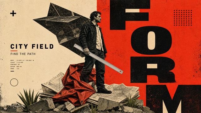
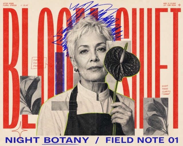
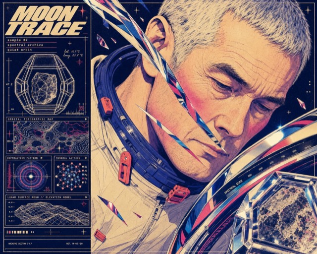
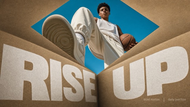
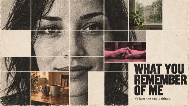
Editorial + Minimal · AI image style prompt
Cobalt Xerox Script Editorial Poster
Compressed cobalt posters where fragmented grotesk headlines, two enormous repeated outline-script words, an ambiguous macro halftone photo, a dark flat Xerox cutout, and dense microcopy collide edge to edge.
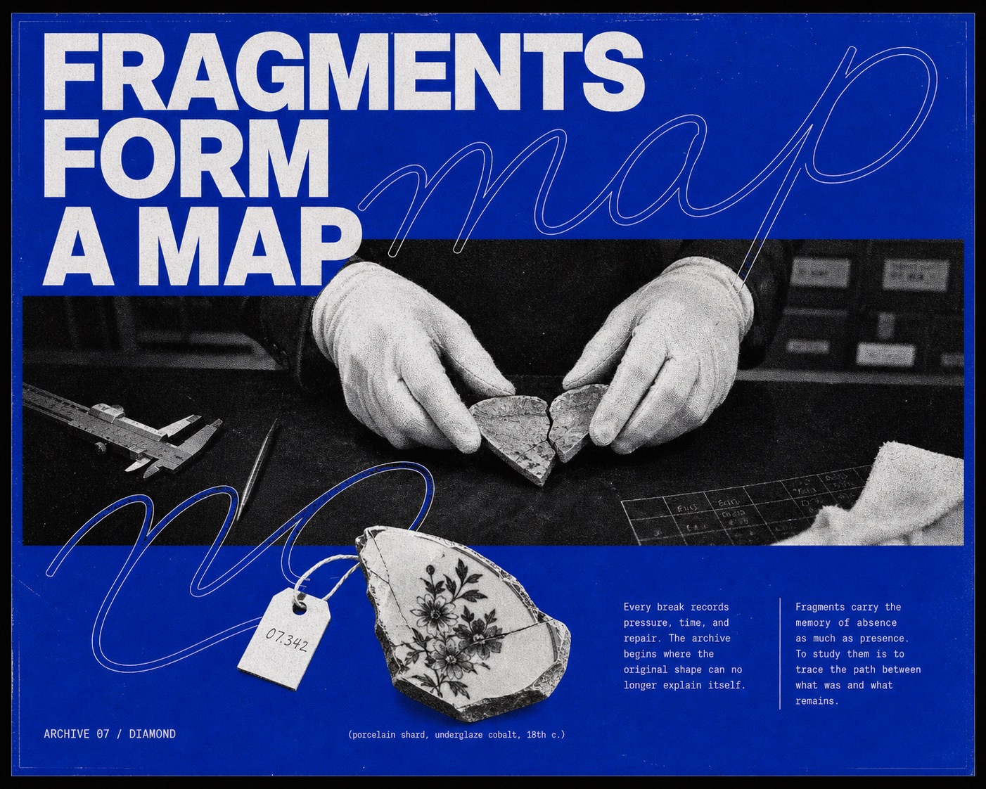
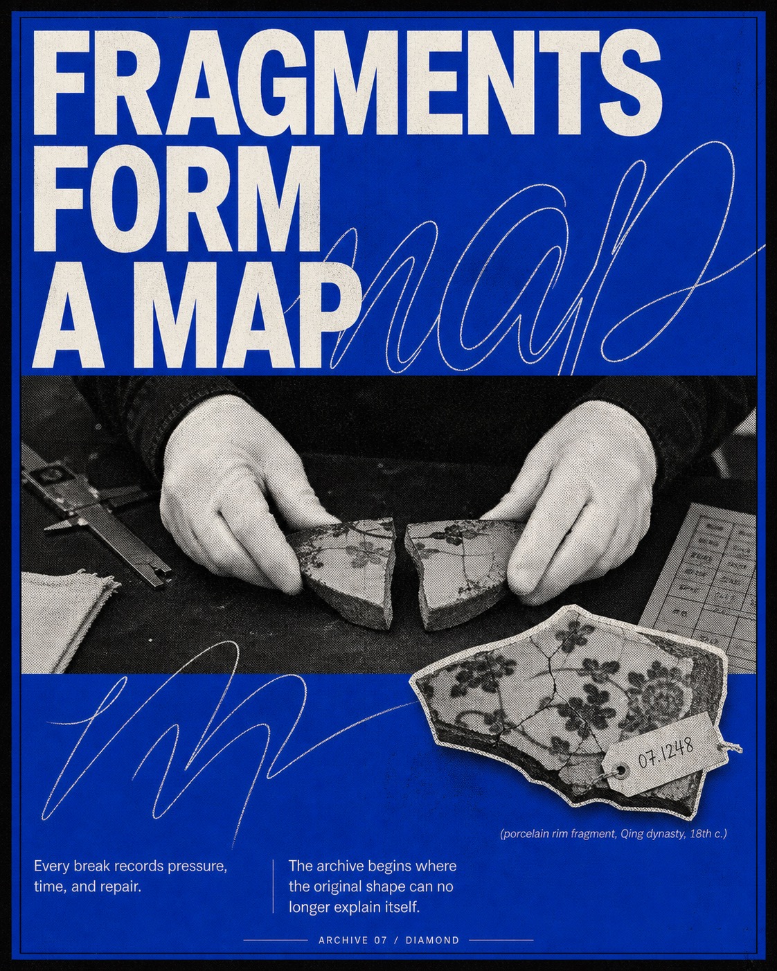
What this style does
A compressed, confrontational cobalt editorial poster system in which fragmented grotesk headlines, two enormous repeated outline-script words, an ambiguous macro halftone photograph, a dark flat Xerox cutout, and dense microcopy collide across nearly the entire page.
Signature traits
- The poster artwork fills the raster nearly edge to edge with only a thin black keyline; there is no outer black presentation mat, floating card, wall mockup, or large safe margin.
- Page density is extremely high: typography, script, photo, cutout, and microcopy occupy roughly 88 to 94 percent of the usable poster, leaving only narrow cobalt seams rather than large calm blue fields.
- The supplied all-caps headline is forcibly split into two separate monumental neo-grotesk blocks: the opening words crowd the upper band and the remaining words reappear below the photo, never as one tidy complete title at the top.
- One selected word from the new headline is written twice as an enormous legible hairline cursive outline, each instance wider than the page and visibly cropped, crossing behind and in front of the headline and photo boundaries.
- A single wide black-and-white photo panel uses an ambiguous extreme macro crop with almost no environmental context; surface, gesture, or anatomy fills the frame at confrontational scale instead of showing a normal documentary scene.
- The photograph has aggressive Xerox and coarse newspaper-halftone treatment with visibly enlarged dots, crushed carbon-black shadows, chalk-white highlights, and rough tonal breakup.
style.json
{
  "style_name": "Cobalt Xerox Script Editorial Poster",
  "style_slug": "cobalt-xerox-script-editorial-poster-style",
  "style_version": "2.2",
  "style_summary": "A compressed, confrontational cobalt editorial poster system in which fragmented grotesk headlines, two enormous repeated outline-script words, an ambiguous macro halftone photograph, a dark flat Xerox cutout, and dense microcopy collide across nearly the entire page.",
  "category": "Editorial + Minimal",
  "environment_variables": {
    "SUBJECT": "the main person, object, or conceptual subject shown in the halftone photograph",
    "SUBJECT_ACTION": "the subject's clear action or state",
    "PRODUCT_OR_PROP": "the isolated prop or symbolic object used as the lower cutout",
    "LOCATION": "the setting implied inside the photographic panel",
    "BACKGROUND_ELEMENTS": "secondary details visible in or around the photographic panel",
    "MAIN_TEXT": "the original all-caps headline written for the new case",
    "SECONDARY_TEXT": "the original micro-editorial supporting copy written for the new case",
    "ACCENT_SYMBOL": "a small non-branded editorial symbol or catalog mark",
    "WARDROBE_STYLE": "wardrobe, material, or styling direction for the new subject",
    "STYLE_FIDELITY_ANCHORS": "observable style traits that must remain visible",
    "SOURCE_CONTENT_TO_AVOID": "literal source content that generated samples must not recreate",
    "ASPECT_RATIO": "4:5 or 5:4"
  },
  "style_fidelity_anchors": [
    "The poster artwork fills the raster nearly edge to edge with only a thin black keyline; there is no outer black presentation mat, floating card, wall mockup, or large safe margin.",
    "Page density is extremely high: typography, script, photo, cutout, and microcopy occupy roughly 88 to 94 percent of the usable poster, leaving only narrow cobalt seams rather than large calm blue fields.",
    "The supplied all-caps headline is forcibly split into two separate monumental neo-grotesk blocks: the opening words crowd the upper band and the remaining words reappear below the photo, never as one tidy complete title at the top.",
    "One selected word from the new headline is written twice as an enormous legible hairline cursive outline, each instance wider than the page and visibly cropped, crossing behind and in front of the headline and photo boundaries.",
    "A single wide black-and-white photo panel uses an ambiguous extreme macro crop with almost no environmental context; surface, gesture, or anatomy fills the frame at confrontational scale instead of showing a normal documentary scene.",
    "The photograph has aggressive Xerox and coarse newspaper-halftone treatment with visibly enlarged dots, crushed carbon-black shadows, chalk-white highlights, and rough tonal breakup.",
    "A single irregular, mostly black cutout object intrudes across the lower headline and the gap between two microcopy columns; it is flat and shadowless, never a centered product hero on empty blue.",
    "Two dense narrow columns of tiny white editorial text sit hard against the bottom area, each forming a compact block of roughly eight to twelve short lines, partially crowded by the cutout.",
    "The palette is restricted to intense cobalt blue, paper white, and carbon black; the blue behaves like uneven spot ink and the monochrome elements look physically reproduced.",
    "All layers remain flat and print-based with deliberate collisions: letters are cropped, script crosses the photo, the cutout obscures type, and no element receives realistic depth, bevel, or drop shadow.",
    "Coarse paper tooth, toner freckles, halftone dots, ink starvation, and scan grain remain clearly visible across the blue field, white letters, photo, and cutout while preserving the main headline.",
    "The mood is unresolved, cerebral, abrasive, and poetic, closer to an experimental photocopied poster or independent art journal than to a clean archival infographic."
  ],
  "source_content_to_avoid": [
    "Do not recreate the extreme close-up of a person's eyes, brow, nose, gaze, or any identifiable face from the reference.",
    "Do not use a pinecone, cone-shaped seed pod, or a cutout object with the same clustered scale silhouette.",
    "Do not repeat or paraphrase the source slogan about everything, making sense, or not making sense.",
    "Do not use the source masthead name, the phrase about thoughts through posters, its unidentified-object caption, or its body-copy wording.",
    "Do not copy the same face crop, eye placement, cutout position, or exact line breaks from the source poster.",
    "Do not reproduce any source signature, brand mark, watermark, creator identifier, or platform mark.",
    "Do not retain the original story premise of interpreting an ambiguous face through an unidentified natural object."
  ],
  "visual_deconstruction": {
    "overall_style": "Experimental Xerox editorial poster with Swiss-derived megatype pushed into postmodern collision, macro photographic ambiguity, and photocopied art-journal materiality.",
    "composition_and_layout": "The poster behaves as one compressed field rather than four clean cards. Fragmented headline blocks, two page-wide script repetitions, the macro photo, the lower headline, an intrusive dark cutout, and twin microcopy columns physically overlap and compete.",
    "subject_placement": "The photographic subject is so tightly cropped that it reads first as texture or anatomy and only second as a scene. A separate irregular black cutout punctures the lower typography instead of sitting politely in an empty display zone.",
    "camera_and_perspective": "The photo uses confrontational macro proximity with minimal context and ambiguous scale. Graphic layers stay orthographic, flat, and mechanically reproduced.",
    "typography": "The all-caps headline is fragmented across the page; hairline cursive is repeated twice at larger-than-page scale; tiny neutral sans copy is packed into two dense footer columns.",
    "color_behavior": "One vivid cobalt ink behaves as the paper field, balanced by high-contrast white type and black-and-white imagery.",
    "graphic_elements": "Thin keyline, micro-masthead labels, two cropped cursive word outlines, rectangular macro photo window, fragmented lower megatype, dense twin footer columns, intrusive shadowless cutout, and a tiny parenthetical catalog caption.",
    "texture_and_finish": "Clearly visible enlarged halftone dots, blue spot-ink grain, toner freckles, ink-starved white letters, edge chatter, and scanned paper tooth across the full page.",
    "lighting": "Hard monochrome contrast with crushed black areas and clipped highlights; no dimensional lighting on graphic layers.",
    "mood_and_reference": "Mysterious, intellectual, poetic, and raw; an independent cultural magazine translated into a collectible poster."
  },
  "composition": [
    "Fill the raster with the poster itself. Keep only a one-to-two-percent black perimeter keyline and a compact cobalt inset; never add a surrounding black mat or presentation background.",
    "Split every supplied headline into an upper fragment and a lower fragment. The upper fragment occupies roughly 18 to 24 percent of the page; the lower fragment occupies another 14 to 20 percent beneath the photo.",
    "Never place the complete headline as one tidy block at the top. At least one major word must appear below the photo and be partially overlapped by the cutout.",
    "Place one wide photo rectangle through the middle, spanning 84 to 94 percent of the width and roughly 25 to 32 percent of the height. The image must be an extreme macro crop, not a normal scene.",
    "Write one recognizable word from the new headline twice in hairline outline cursive. Each repetition must span 120 to 170 percent of the poster width, be visibly clipped at both sides, and cross at least two structural zones.",
    "Make the irregular black cutout overlap both the lower headline and the central gap between the two dense footer columns. It must never float alone in the middle of empty blue.",
    "Compress the footer into two hard rectangular columns of eight to twelve short lines each, with a tiny caption close to the cutout and minimal breathing room.",
    "Aim for 88 to 94 percent visual occupancy. Use collisions, crops, and layer obstruction deliberately; reject clean template spacing, centered product-display balance, or large unused blue areas.",
    "For 5:4, widen the same collision system instead of making a conventional banner: upper and lower headline fragments remain separate, the macro photo stays horizontal, both script repetitions cross the full width, and the cutout still breaks into the footer."
  ],
  "typography": {
    "headline": "Monumental white all-caps neutral neo-grotesk with compact tracking, very tight leading, ink-starved edges, and mandatory fragmentation between the upper and lower page.",
    "script": "A legible single word from the new headline, repeated exactly twice in enormous italic monoline cursive outline; both repetitions exceed page width, remain partially cropped, and cross other layers rather than acting as a small decorative swoosh.",
    "microcopy": "Tiny white neutral sans serif packed into two narrow editorial blocks of eight to twelve lines each, dense enough to read as magazine text texture but still aligned.",
    "labels": "Very small uppercase masthead and centered kicker, plus a parenthetical catalog caption beneath the cutout.",
    "hierarchy": "Fragmented headline and macro photo share dominance; repeated script destabilizes their boundaries; the dark cutout interrupts the lower headline; dense microcopy completes the compressed footer."
  },
  "color_palette": {
    "electric_cobalt": "#1F57F2",
    "paper_white": "#F4F4EE",
    "carbon_black": "#0A0A0A",
    "proportions": "Use approximately 68 percent cobalt, 20 percent black or halftone shadow, and 12 percent white type and highlight.",
    "behavior": "Use flat spot-color areas only; simulate analog ink variation with restrained grain, not hue variation."
  },
  "image_treatment": [
    "Render the main photograph in black and white with visibly enlarged newspaper dots, aggressive Xerox contrast, crushed black masses, and chalk-white highlight islands.",
    "Use an extreme macro crop in which one fragment of the new subject fills most of the photo rectangle and the wider setting becomes almost unreadable; reject conventional documentary framing.",
    "Treat the lower prop as a torn-paper Xerox cutout with an irregular silhouette, mostly carbon-black interior, paper-white edge chatter, and absolutely no realistic shadow.",
    "Keep photographic context to a few dark ambiguous fragments so the image feels psychological and tactile rather than explanatory.",
    "Carry coarse paper tooth and toner damage through the blue field and white type as well as the photograph; the finished page should resemble a physical scan, not clean digital vector artwork."
  ],
  "design_rules": [
    "Preserve the collision of five mandatory layers: fragmented upper headline, first giant script repetition, macro halftone photo, second giant script repetition plus lower headline, and cutout-crowded microcopy footer.",
    "Use exactly one dominant photograph and exactly one lower cutout object; additional imagery should remain minor background detail.",
    "Keep all copy original to the new case, but supply enough supporting prose to build two visually dense footer columns.",
    "Force meaningful obstruction: script crosses headline and photo, the lower cutout covers some letters and intrudes into both text columns, and selected headline edges leave the frame.",
    "Maintain a print-first flatness with no bevels, glossy effects, 3D extrusion, or realistic drop shadows.",
    "Use clearly visible analog surface character across the entire page while keeping only the main headline fully readable.",
    "Retain the cobalt-white-black palette across every case and both aspect ratios.",
    "Keep micro-labels anonymous and archival; never invent a logo or platform identity.",
    "Reject any result that resembles a clean institutional infographic, museum placard, product advertisement, or archival data poster."
  ],
  "do": [
    "Use aggressive density, blunt type collisions, cropped letterforms, and asymmetry.",
    "Repeat one legible cursive outline word twice at larger-than-page scale.",
    "Use one ambiguous macro monochrome subject detail and one irregular dark shadowless cutout.",
    "Split the fresh headline between the upper and lower page and supply enough prose for dense twin columns.",
    "Make coarse halftone, toner freckles, paper tooth, and uneven blue ink visible at first glance.",
    "Preserve the horizontal macro-photo window and cutout-crowded footer in both ratios."
  ],
  "avoid": [
    "Avoid photorealistic full-color imagery, smooth grayscale, cinematic color grading, or glossy commercial polish.",
    "Avoid gradients, neon glows, lens flares, chromatic aberration, 3D type, bevels, and cast shadows.",
    "Avoid clean infographic spacing, large empty blue fields, centered product-hero layouts, tidy museum labels, and generous safe margins.",
    "Avoid putting the complete headline at the top or reducing the cursive lettering to a small abstract loop.",
    "Avoid normal documentary scenes, medium shots, explanatory environments, and fully visible people.",
    "Avoid circular product medallions floating by themselves, realistic object shadows, decorative sticker clutter, multiple product shots, comic panels, or scrapbook layering.",
    "Avoid copying the source person's face, eye crop, pinecone-like object, text, masthead, or exact line breaks.",
    "Avoid logos, watermarks, usernames, QR codes, signatures, and platform marks.",
    "Avoid an outer black presentation mat or poster mockup; the cobalt artwork must fill the raster nearly edge to edge.",
    "Avoid illegible main-headline gibberish; render only the supplied original headline and keep microcopy visually plausible."
  ],
  "prompt_template": "Create a finished {ASPECT_RATIO} poster in the \"cobalt-xerox-script-editorial-poster-style\" visual system. The cobalt artwork itself must fill the raster nearly edge to edge, bounded only by a one-to-two-percent black keyline. Do not show a black presentation mat, floating card, wall, frame, room, or mockup.\n\nSTYLE FIDELITY IS THE FIRST PRIORITY. These anchors are mandatory: {STYLE_FIDELITY_ANCHORS}\nLITERAL SOURCE CONTENT MUST CHANGE. Exclude: {SOURCE_CONTENT_TO_AVOID}\n\nNew macro subject: {SUBJECT}\nAction or state visible in the macro crop: {SUBJECT_ACTION}\nIrregular lower Xerox cutout: {PRODUCT_OR_PROP}\nLocation that should be only faintly implied: {LOCATION}\nMinimal background fragments: {BACKGROUND_ELEMENTS}\nNew all-caps headline: {MAIN_TEXT}\nOriginal two-column editorial copy: {SECONDARY_TEXT}\nTiny archival mark: {ACCENT_SYMBOL}\nWardrobe or material styling: {WARDROBE_STYLE}\n\nHARD COMPOSITION LOCK — all six requirements must be visible:\n1. Split the supplied headline into two physically separate monumental white neo-grotesk blocks. Put only the opening words in the crowded upper band and reserve the remaining words for a second huge block below the photograph. Never place the complete headline together at the top.\n2. Select one recognizable word from the supplied headline and write that same word exactly twice as enormous thin white outline-only cursive lettering. Each repetition must be wider than the poster, visibly cropped at both sides, and cross at least two zones. These are legible word contours, not small abstract loops or decorative swooshes.\n3. Place one wide horizontal black-and-white photograph through the middle, spanning 84 to 94 percent of the width. Use an ambiguous extreme macro crop: one tactile fragment of the new subject fills the frame, with almost no explanatory environment. Reject normal documentary composition or a medium shot.\n4. Place the second headline block immediately below the photo at the same monumental scale as the upper block. Allow the second cursive repetition and the cutout to obscure parts of these letters.\n5. Convert the supplied prop into one irregular, mostly carbon-black, torn-edge Xerox cutout. Make it intrude across the lower headline and the gap between the footer columns. Keep it flat and shadowless; never center it alone as a product hero on empty blue.\n6. Pack the bottom with two narrow white microcopy columns, each roughly eight to twelve short lines, plus a tiny parenthetical caption. The cutout must crowd both columns. Total visual occupancy must feel about 88 to 94 percent, with only narrow cobalt seams.\n\nTypography: monumental paper-white all-caps neutral neo-grotesk with very tight leading, compact tracking, deliberate edge cropping, and ink-starved toner damage; two larger-than-page legible cursive repetitions in a single hairline white outline; tiny dense white editorial columns; microscopic anonymous masthead and kicker. Render the supplied main headline exactly without inventing names or logos.\nColor and texture: use only intense electric cobalt blue, warm paper white, and carbon black. Apply clearly visible coarse paper tooth, blue spot-ink grain, toner freckles, enlarged halftone dots, distressed white-letter edges, ink starvation, and slight scan roughness across the entire page. The photo must have crushed black masses and chalk-white highlights. Keep this physical-print texture intentional and legible rather than digitally muddy.\nFlatness: all elements are orthographic pasted print layers. No realistic cast shadows, product lighting, bevels, depth, or floating cards.\nRatio behavior: adapt the collision system to {ASPECT_RATIO} without simplifying it. Both ratios must retain two separate headline blocks, two cropped cursive word repetitions, one horizontal macro photo, one intrusive cutout, and dense twin footer columns.\nMood: unresolved, cerebral, abrasive, poetic, and physically photocopied; experimental art-journal poster energy, not a clean archival infographic.\n\nAvoid clean template spacing, large empty cobalt zones, complete headline only at the top, a single decorative script loop, normal documentary scenes, explanatory environments, centered circular product medallions, realistic object shadows, infographic balance, museum-label design, full-color photography, extra hues, gradients, glossy polish, smooth grayscale, 3D type, glow, comic panels, sticker clutter, logos, watermarks, usernames, QR codes, signatures, platform marks, and presentation mockups.\n\nMatch this dense collision system before changing content. Change the source subject, action, prop, location, text, and story premise while preserving the macro crop, fragmented type hierarchy, repeated script grammar, analog texture, and lower-page congestion.",
  "negative_prompt": "Outer black presentation mat, floating poster card, wall mockup, room scene, clean infographic, archival placard, museum label, large empty blue field, generous safe margin, complete headline only at top, small abstract script loop, only one cursive repetition, conventional documentary scene, medium shot, fully visible person, centered product hero, circular medallion floating alone, realistic object shadow, source face or eyes, pinecone, seed cone, source slogan, source masthead, copied body text, copied line breaks, logo, watermark, username, signature, QR code, platform mark, full-color photography, additional hues, gradient, glossy finish, smooth digital grayscale, 3D type, extrusion, bevel, glow, cinematic lighting, lens flare, sticker clutter, comic panels, illegible main headline.",
  "examples": [
    {
      "case_name": "ceramic-archive",
      "values": {
        "SUBJECT": "the near-abstract macro junction of two white-gloved fingertips, a black sleeve edge, and a cracked ceramic glaze, with no face or full hand visible",
        "SUBJECT_ACTION": "pressing the two fractured glaze edges close enough that the dark seam dominates the image",
        "PRODUCT_OR_PROP": "an irregular mostly black silhouette of a broken porcelain fragment with one jagged white glaze vein and a torn catalog tag",
        "LOCATION": "a silent museum conservation laboratory after hours",
        "BACKGROUND_ELEMENTS": "only a sliver of shadowed caliper metal, a torn cotton fiber, and a nearly lost catalog grid",
        "MAIN_TEXT": "FRAGMENTS FORM A MAP",
        "SECONDARY_TEXT": "Every break records pressure, time, and repair. The archive begins where the original shape can no longer explain itself. A missing edge becomes evidence; a stain becomes chronology. Reconstruction does not erase damage. It gives the damage a position, a scale, and a relation to what remains.",
        "ACCENT_SYMBOL": "ARCHIVE 07 / ◇",
        "WARDROBE_STYLE": "matte black cotton sleeves and plain white conservation gloves"
      }
    },
    {
      "case_name": "shortwave-signal",
      "values": {
        "SUBJECT": "an extreme macro crop of a thumb pad, the serrated edge of a radio tuning wheel, and a black headphone cable, with no face or full device visible",
        "SUBJECT_ACTION": "turning the wheel until the skin, metal teeth, and static-marked scale collide in one ambiguous close detail",
        "PRODUCT_OR_PROP": "an irregular tangled radio coil and torn frequency-scale fragment rendered as one mostly black Xerox silhouette",
        "LOCATION": "a rooftop radio station during a power outage",
        "BACKGROUND_ELEMENTS": "two faint antenna diagonals, a clipped strip of frequency numbers, and one chalk-white equipment glint",
        "MAIN_TEXT": "STATIC HOLDS A SIGNAL",
        "SECONDARY_TEXT": "Noise is not empty. A patient receiver finds rhythm, distance, and intention inside the interrupted band. Each burst carries weather, voltage, and miles of missing context. The hand returns to the dial because uncertainty is structured. What sounds broken may only be waiting for the right interval.",
        "ACCENT_SYMBOL": "BAND 31 / +",
        "WARDROBE_STYLE": "unbranded dark work jacket with a utilitarian over-ear headset"
      }
    },
    {
      "case_name": "tidal-field-note",
      "values": {
        "SUBJECT": "an extreme macro crop of a mud-dark glove pinching the wet glass rim and numbered meniscus of a rain gauge, with no person or landscape fully visible",
        "SUBJECT_ACTION": "tilting the gauge so the liquid line, glove grain, and enlarged measurement marks become the entire photographic event",
        "PRODUCT_OR_PROP": "an irregular mostly black corroded tidal-sensor head with torn fins, cable fibers, and one white calibration scar",
        "LOCATION": "a wind-flattened coastal salt marsh",
        "BACKGROUND_ELEMENTS": "two blurred reed slashes, a black horizon fragment, water beads, and one cropped notebook corner",
        "MAIN_TEXT": "WEATHER LEAVES A TRACE",
        "SECONDARY_TEXT": "The storm departs before the evidence settles. Measurement turns a vanished event into a pattern that can be read. Water marks the glass, pressure bends the reed, and time enters as a sequence of small differences. The field note holds what the horizon has already forgotten.",
        "ACCENT_SYMBOL": "FIELD 12 / △",
        "WARDROBE_STYLE": "plain waterproof shell and textured black field gloves without branding"
      }
    },
    {
      "case_name": "night-transit-memory",
      "values": {
        "SUBJECT": "an extreme macro crop of one fingertip, a wool cuff fiber, and a tiny rectangular route marker against a black mechanical board, with no full hand or control room",
        "SUBJECT_ACTION": "pressing the marker into a track slot so skin ridges, chipped paint, and route lines fill the photo",
        "PRODUCT_OR_PROP": "an irregular mostly black wad of punched timetable tape and torn route-map paper with one sharp white transit line",
        "LOCATION": "a dim underground rail control room before sunrise",
        "BACKGROUND_ELEMENTS": "cropped route numerals, one switch-label fragment, paper perforations, and a chalk-white lever edge",
        "MAIN_TEXT": "MEMORY MOVES IN CIRCLES",
        "SECONDARY_TEXT": "A city repeats itself through routes, pauses, and returns. The system remembers even when the platform is empty. Each marker carries a departure, a delay, and a promised reappearance. The board is reset every night, but its worn slots retain the pressure of thousands of decisions.",
        "ACCENT_SYMBOL": "LINE 04 / ○",
        "WARDROBE_STYLE": "dark wool uniform cuff with a simple unbranded metal button"
      }
    }
  ]
}